Typedesign
Editorial
Linxaro Typeface
University Project:
New Design University
Design & Concept:
Naomi Hinkelmann
Exhibited at:
MONEO (Vienna Design Week, Kyoto, Münster)
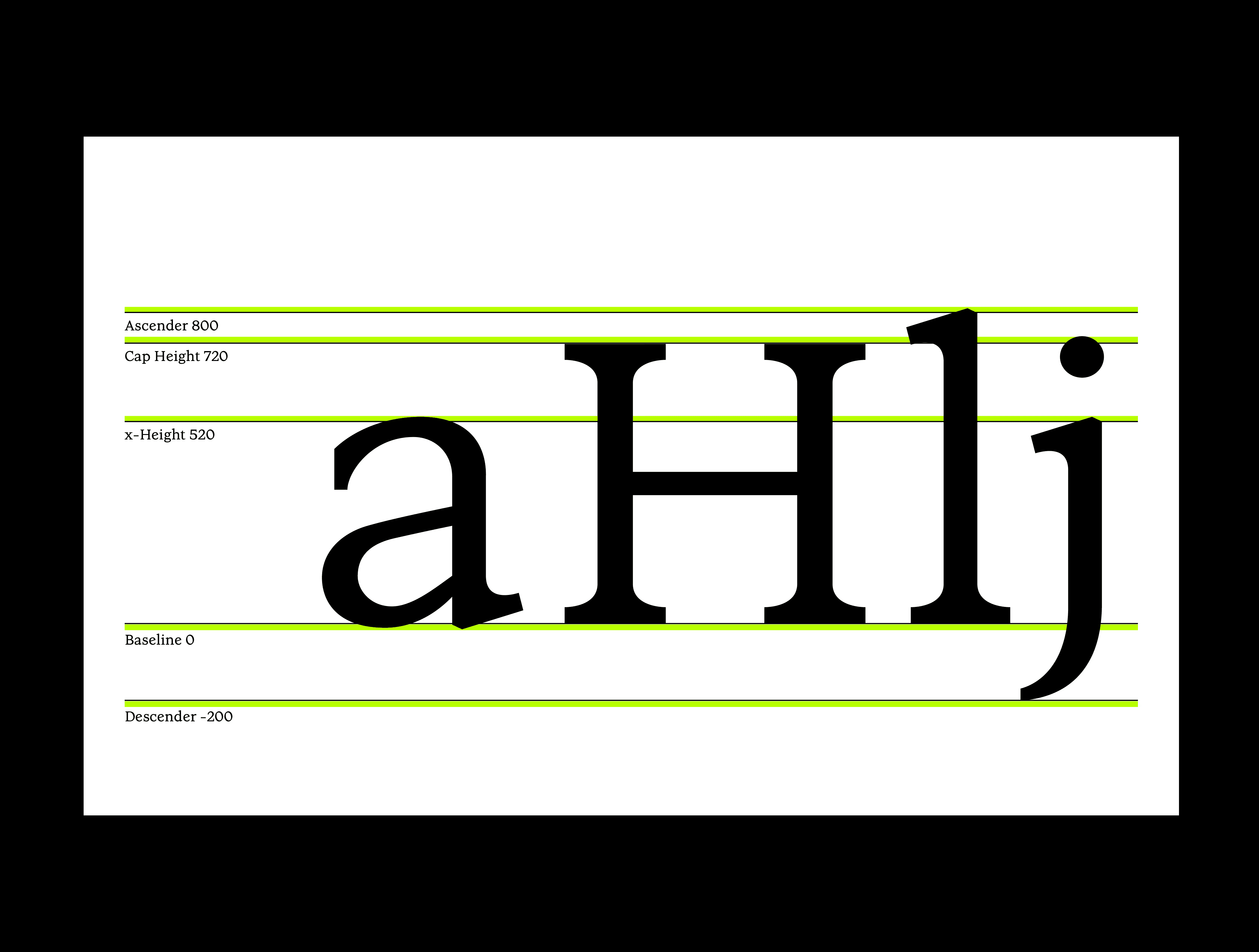
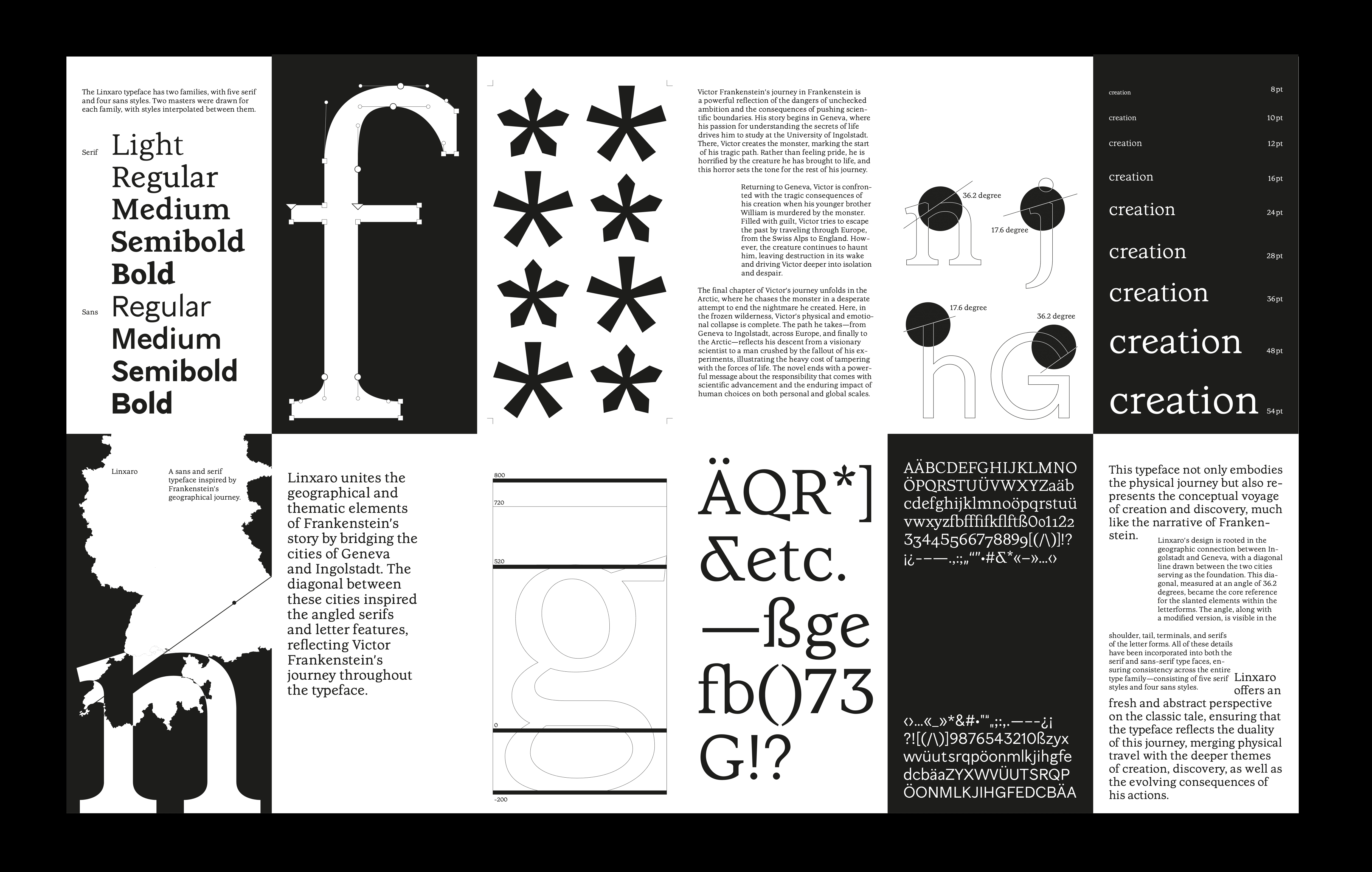
Linxaro is a conceptual typeface that unites geographical and thematic elements from Mary Shelley's Frankenstein, bridging the narrative’s key locations: Geneva and Ingolstadt. A diagonal line connecting these two cities—measured at an angle of 36.2 degrees—served as the foundational design element. This angle is consistently echoed throughout the typeface, informing the slanted details in serifs, terminals, shoulders, and tails across the letterforms.
Designed during an advanced typography course, Linxaro consists of a complete type family with five serif and four sans-serif styles, each containing 130 glyphs. The typeface not only visualizes the physical journey of Victor Frankenstein but also reflects the deeper themes of creation, ambition, and the consequences of pushing boundaries.
By translating Shelley's narrative into visual form, Linxaro offers a fresh and abstract interpretation of the classic tale—merging structure with story, and design with literary depth.